44 Introduction to Directed Acyclic Graphs
This chapter is under heavy development and may still undergo significant changes.
The field of statistics has produced many tools that we can use to quantify, and therefor estimate, the effect of random error if we are willing to make certain assumptions. Similarly, pioneers in the field of causal inference (e.g., Judea Pearl, Jamie Robbins, Sander Greenland, and Miguel Hernán) have refined and tested tools that allow us to estimate average causal effects from observational data if we are willing to make certain assumptions. One of those tools – the one we will focus on in this chapter – is called a directed acyclic graph, or DAG for short. A very simple DAG is shown here.

Putting it simply, DAGs are just graphs that help us tell a story about causes and effects. For example, perhaps the x node in the DAG above represents the position of a light switch and and the y node in the DAG above represents the status of a light bulb (on vs. off). Then, the causal story that DAG above would tell is that changing the position of the light switch causes the light bulb to turn on and off. Because it is a graph, the entire story of causes and effect is summarized into a compact visual representation. More importantly, it turns out that these graphs, powered by a mathematical language called graph theory contain mathematical information that will eventually allow us to make estimates of causal effects, if we are willing to accept some assumptions. In this chapter, we will discuss some of the basic nuts and bolts of DAGs; as well as how to create DAGs with R. In future chapters, we will progressively learn more about using DAGs as a tool for causal inference.
44.1 Basic DAG structures and vocabulary
DAGs are made from nodes and edges. In figure 44.1, x, y, and z are nodes, and A and B are edges. You may see the DAGs where the nodes are literal dots, and you may see DAGs that use variable names as the nodes. Figure 44.1 has an example of each. Nodes represent the variables we are modeling, and edges encode the relationship between the variables we are modeling.
Two nodes are said to be adjacent to each other if there is an edge connecting them. For example, x and y are adjacent in figure 44.1, but x and z are not.
Edges can be directed or undirected. Edges that are directed have an arrowhead on at least one end, and edges that are undirected do not. Edges A and B in figure 44.1 are both directed because they both have an arrowhead on one end. The “start” or “out” side of a directed edge is the side that doesn’t have an arrowhead, and the “end” or “in” side does have an arrowhead. For example, edge A in figure 44.1 starts at node x and ends at node y. If all of the edges in a graph are directed, then the graph is said to be a directed graph.
Are the graphs in figure 44.1 both directed graphs?
Yes, the are both directed graphs because all of the edges are directed.
When there are two nodes connected by a directed edge, the start of the edge is the cause and the end of the edge is the effect. So, the story figure 44.1 tells is that x causes y and y causes z.
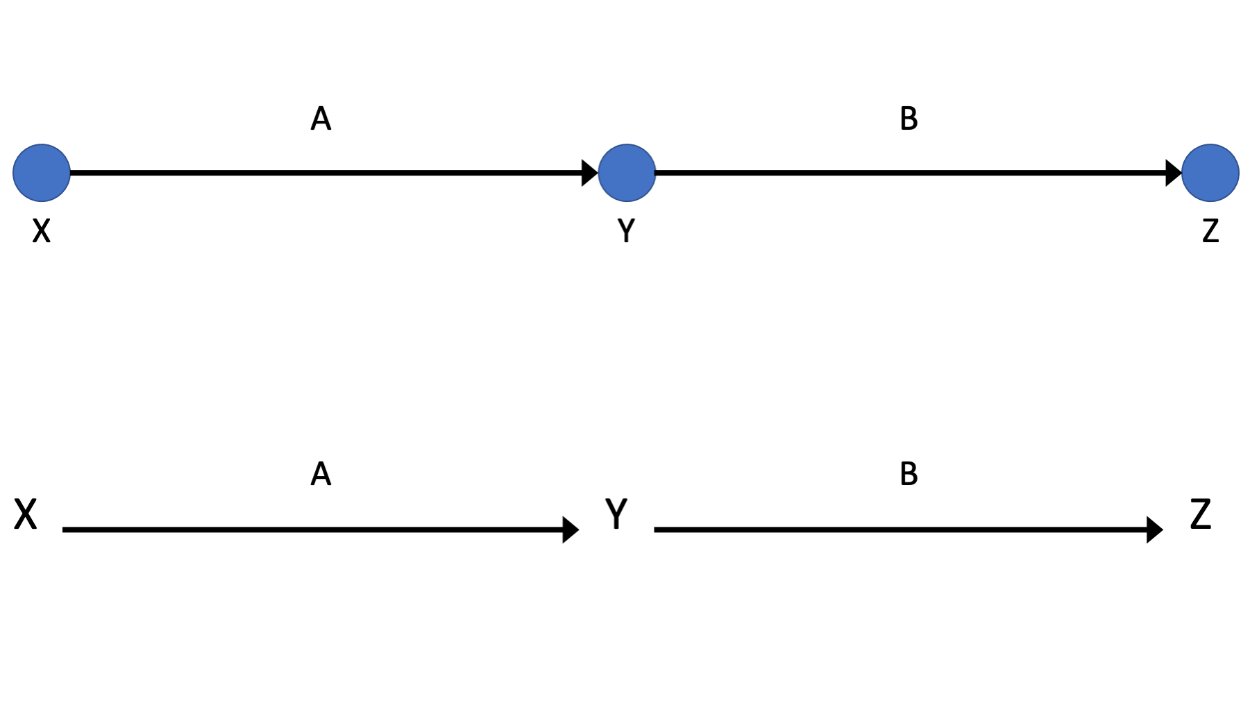
Figure 44.1: Basic DAG Structures: Nodes and edges.
Relationships between nodes in a DAG are often described in terms of family relationships. The node a the start of a directed edge is called a parent of the node the directed edge ends at. Conversely, the node at the end of the directed edge is called a child of the node the directed edge started from. In 44.2, x is a parent of y and a grandparent of z. Equivalently, y is a child of x , z is a child of y, and z is a grandchild of x.
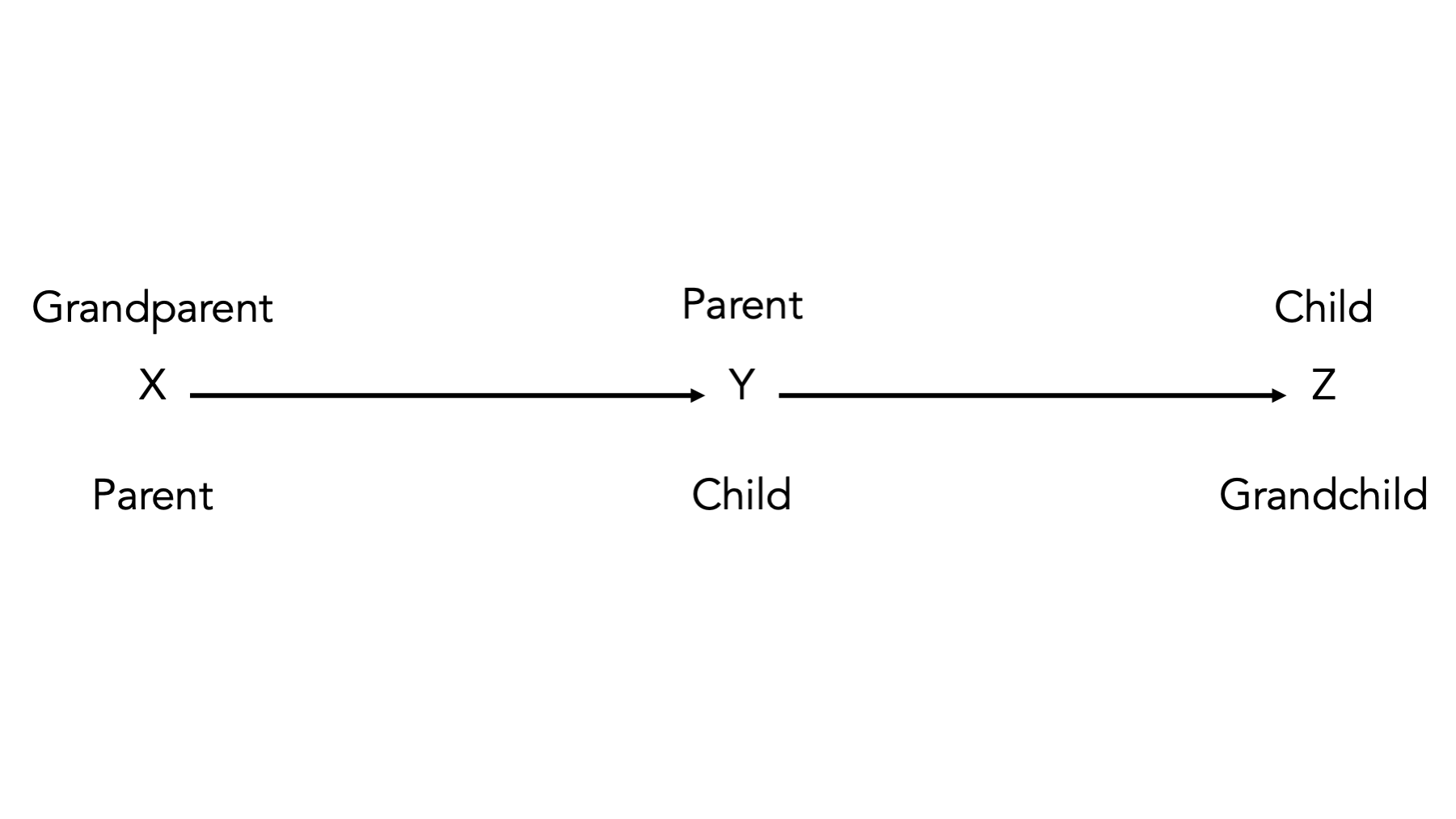
Figure 44.2: Basic DAG Structures: Descendants.
A directed path (often simply referred to as a path) is any arrow-based route between two variables on the graph. In 44.3, there is a path from x to y, from y to z, and from x to z that goes through y. Paths are either open or closed according to D-separation rules, which we will discuss soon.

Figure 44.3: Basic DAG Structures: Paths.
When there is at least one directed path from a node that leads back to itself, then the graph is said to be cyclic. In figure 44.3, there is a path – from x to y to z to x – that begins and ends at x. Therefore, the graph in figure 44.3 is cyclic. If there are no cyclic paths in a graph (as is the case in every other graph we’ve seen in this chapter), then the graph is said to be acyclic. When our graphs are directed and acyclic, then they are called directed acyclic graphs or DAGs.
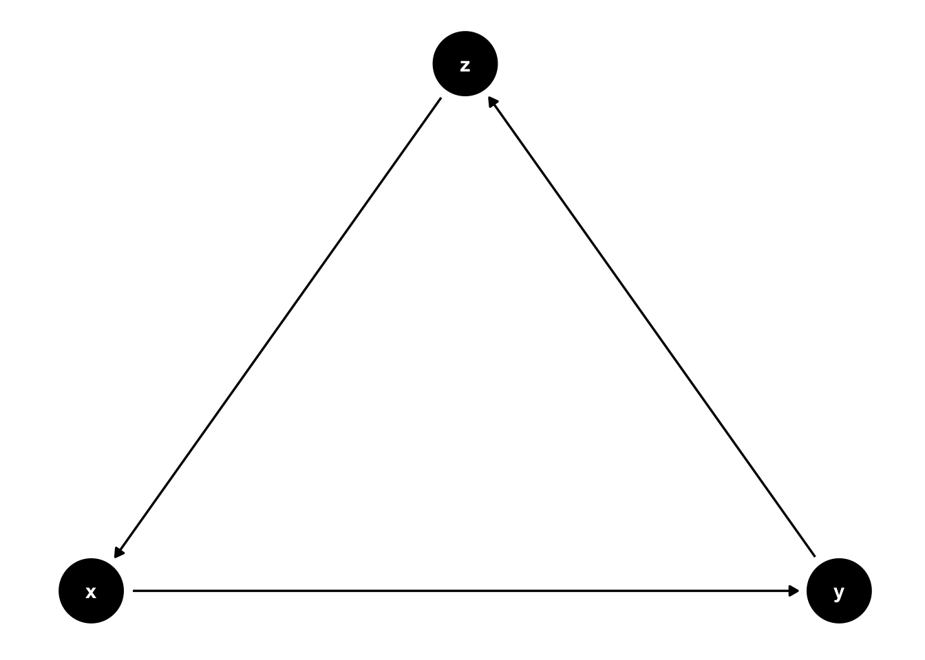
Figure 44.4: Basic DAG Structures: A cyclic graph.
Colliders exist where two arrowheads “collide” into a node. For example, in 44.5, the arrow from x to y and the arrow from z to y “collide” into each other at y.

Figure 44.5: Basic DAG Structures: Colliders.
Note that colliders are path specific. For example, y is a collider on the x -> y <- z path in figure 44.6, but it is not a collider on the x -> y -> W path.
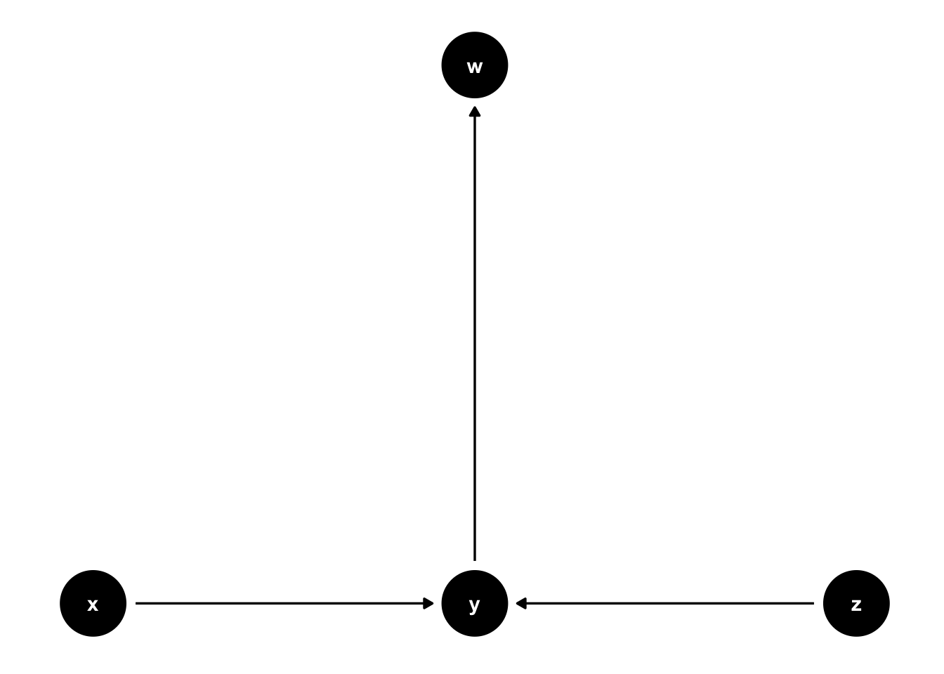
Figure 44.6: Basic DAG Structures: A slightly more complex collider.
Common causes are another important concept when using DAGs. In figure 44.7, y is a common cause of x and z. We know this because an arrow points from y to x and from y to z.
It’s important to note that statistical associations can follow any path regardless of the direction of the arrows (in the absence of colliders). However, causal effects only follow the direction of the arrows (assuming our assumptions are correct). So, in this case, we expect x to be associated with z even though x does not cause z. We can also say that y confounds the relationship (or lack of relationship) between x and z. Confounding is one of the most critical concepts in all of epidemiology, and it has an entire chapter devoted to it later in the book.
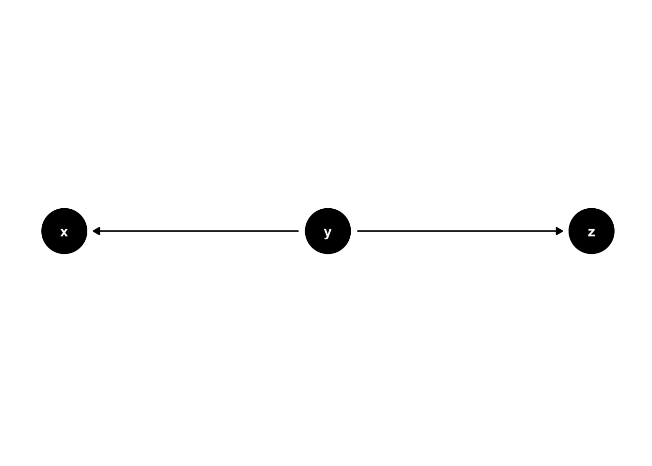
Figure 44.7: Basic DAG Structures: Common causes.
44.2 Creating DAGs in R
There are a number of R packages we can use to create and analyze DAGs in R. DAGitty is a popular tool for creating and DAGs. Notably, DAGitty has a graphical interface we can use to create, edit, and analyze DAGs directly in our web browser. We can access DAGitty in our browser by navigating to https://www.dagitty.net/ and clicking on Launch DAGitty online in your browser, which is the far left box of figure 44.8 below.
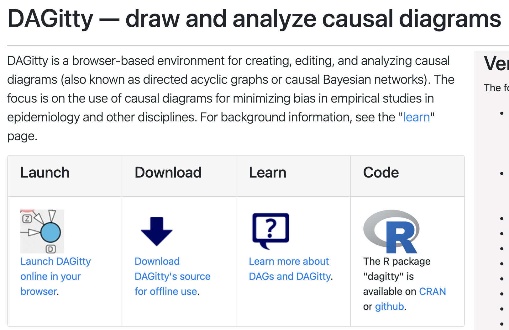
Figure 44.8: Screenshot of the DAGitty homepage.
You might have also noticed the dagitty R package in figure 44.8. It’s a great package that allows us to use DAGitty directly from within an R session, and I encourage interested readers to check it out. However, for the sake of efficiency, we will focus on using a different R package, built on top of dagitty, ggplot2, and ggraph, for the remainder of this chapter. That package is called ggdag.
44.3 Chains
The first DAG structure we will learn how to create with ggdag called a chain. A chain consists of 3 nodes and two edges, with one edges going into the middle node and the other edge coming out of the middle node.17 We have already seen several examples of chains above, for example, figure 44.3. Let’s look at the code we used to create figure 44.3.
# Create a DAG called chain
chain <- dagify(
  y ~ x, # The form is effect ~ cause
  z ~ y,
  # Optionally add coordinates to control the placement of the nodes on the DAG
  coords = list(
    x = c(x = 1, y = 2, z = 3),
    y = c(x = 0, y = 0, z = 0)
  )
)

# Plot the dag called chain and print it to the screen
ggdag(chain) +
  theme_dag()
Now, let’s walk through building the code step-by-step to better understand how it works.
# Create a DAG called chain
chain <- dagify(
  y ~ x # The form is effect ~ cause
)

# Print the value stored in chain to the screen
chain
## dag {
## x
## y
## x -> y
## }👆 Here’s what we did above:
We used the
dagify()function to create an object calledchainthat contains some code used by the DAGitty package to create DAGs.You can type
?dagifyinto your R console to view the help documentation for this function and follow along with the explanation below.The first argument to the
dagify()function is the...argument. The value(s) passed to the...argument should be formula(s). The formulas should have the form effect ~ cause. Where effect and cause are both nodes we want to be included in the DAG. In this cause, we passed the valuey ~ x, which means “y is caused by x.” This value simultaneously tells thedagify()function two things. First, that the DAG needs to have aynode and anxnode if it doesn’t already. Second, that there should be a directed edge in the DAG fromxtoy.Finally, the
dagify()function converts our formula intoDAGittysyntax, whichggdaguses under the hood.
We can see the
DAGittysyntax when we print the value stored inchainto the screen. However, we won’t actually need to manipulate this code in any way.
Next, we can pass the chain object the the ggdag() function to print our DAG to the screen.
# Set seed so that we can reproduce the plot
set.seed(123)

# Plot the chain dag and print it to the screen
ggdag(chain)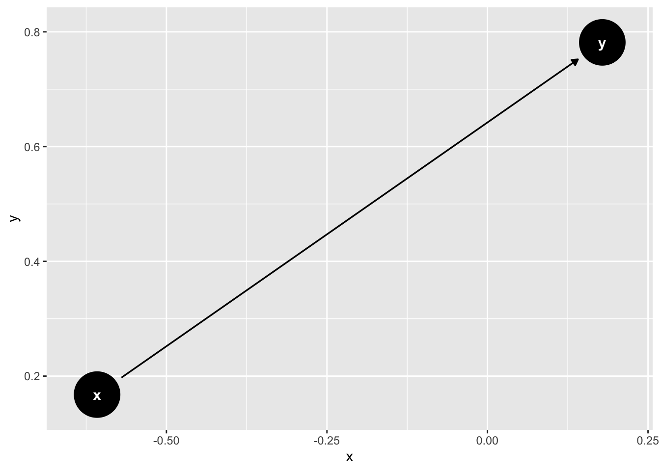
👆 Here’s what we did above:
We used the
ggdag()function to plot thechainobject as aggplot2plot and print it to the screen.You can type
?ggdaginto your R console to view the help documentation for this function and follow along with the explanation below.The first argument to the
ggdag()function is the.tdy_dagargument. The value passed to the.tdy_dagshould be atidy_dagittyobject or adagittyobject. We passed adagittyobject –chain.
The DAG was converted to a
ggplot2plot and printed to the screen. Notice the x and y axis values in the plot above. These values don’t have any substantive meaning. They are simply coordinates used to place the elements of the graph around the plotting area. By default, if we don’t tell thedagify()function which coordinates to use, then it will select coordinates at random. Therefore, if we want our DAG to look the same every time we run the code above, then we must either use theset.seed()function to produce the same random coordinates each time we run the code or we much specifically pass coordinates to thedagify()function.
Let’s pass coordinates to the the dagify() function now so that we have greater control over the layout and reproducibility of our DAG.
# Create a DAG called chain
chain <- dagify(
  y ~ x, # The form is effect ~ cause
  # Optionally add coordinates to control the placement of the nodes on the DAG
  coords = list(
    x = c(x = 1, y = 2),
    y = c(x = 0, y = 0)
  )
)

# Plot the chain dag and print it to the screen
ggdag(chain)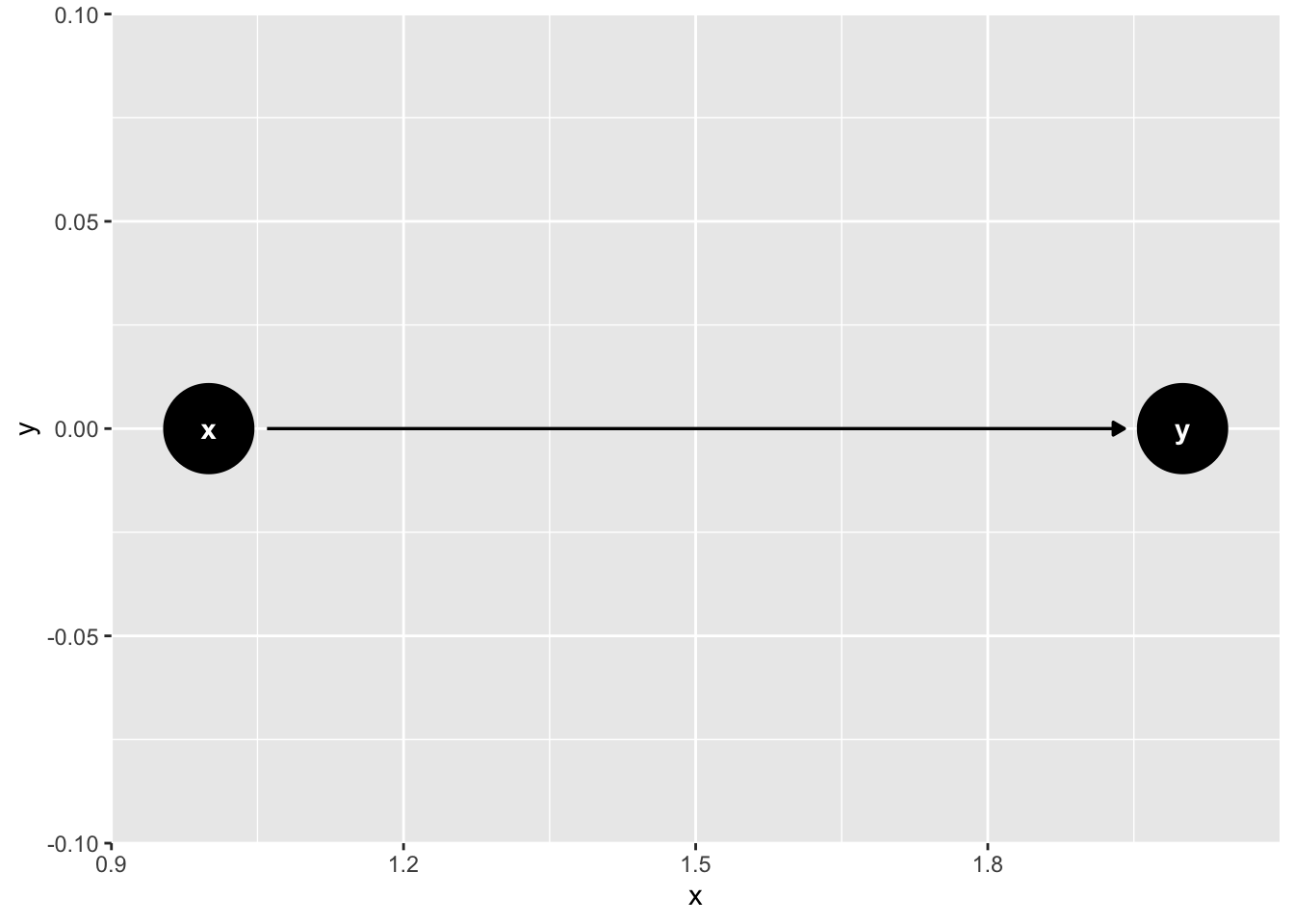
👆 Here’s what we did above:
We used the
dagify()function to create an object calledchainthat contains some code used by the DAGitty package to create DAGs.We passed a list of coordinates to the
coordsargument.The list of coordinates must have an
xelement and ayelement.The
xelement must contain a named vector ofxcoordinate values. The names correspond to node names and the values correspond thexcoordinate value we want each node to have. For example,x = c(x = 1, y = 2)tells thedagify()function that we want the center of thexnode to be placed on the plot at the spot where the x-axis is equal to 1. Similarly, it tells thedagify()function that we want the center of theynode to be placed on the plot at the spot where the x-axis is equal to 2. When we look at the DAG, we can see that thexnode andynode were plotted in those locations. There is nothing magic about choosing the values1and2. We could have selected any value forxthat is less than some other arbitrary value foryand the graph would still look the same. We just happen to think that integer values are easier to work with.The
yelement must contain a named vector ofycoordinate values. The names correspond to node names and the values correspond theycoordinate value we want each node to have. For example,y = c(x = 0, y = 0)tells thedagify()function that we want the center of thexnode and the center of theynode to both be placed on the plot at the spot where the y-axis is equal to 0. When we look at the DAG, we can see that the center of thexnode and theynode both cross the y-axis at 0. There is nothing magic about choosing the value0. We just happen to think that integer values are easier to work with.
We used the
ggdag()function to plot thechainobject as aggplot2plot and print it to the screen.
Now that we know how the coordinate system work, it no longer serves much of a purpose. The x- and y-axis values don’t have any function beyond placing nodes on the plotting area. So, let’s go ahead and remove them. The ggdag package includes a function called theme_dag() that will remove everything from the plot except the nodes and edges. Let’s use it now.
# Create a DAG called chain
chain <- dagify(
  y ~ x, # The form is effect ~ cause
  # Optionally add coordinates to control the placement of the nodes on the DAG
  coords = list(
    x = c(x = 1, y = 2),
    y = c(x = 0, y = 0)
  )
)

# Plot the chain dag and print it to the screen
ggdag(chain) + # Make sure to use a + sign, not a pipe
  theme_dag()
👆 Here’s what we did above:
We used the
ggdag()function to plot thechainobject as aggplot2plot and print it to the screen.This time we added the
theme_dag()theme to our plot to make it easier to read. Notice that we used the+sign to add the theme, not a pipe operator.
At this point, we have learned all of the basic functionality we need to know to create our chain DAG. We just need to add one more node and one more edge.
# Create a DAG called chain
chain <- dagify(
  y ~ x, # The form is effect ~ cause
  z ~ y,
  # Optionally add coordinates to control the placement of the nodes on the DAG
  coords = list(
    x = c(x = 1, y = 2, z = 3),
    y = c(x = 0, y = 0, z = 0)
  )
)

# Plot the chain dag and print it to the screen
ggdag(chain) + # Make sure to use a + sign, not a pipe
  theme_dag()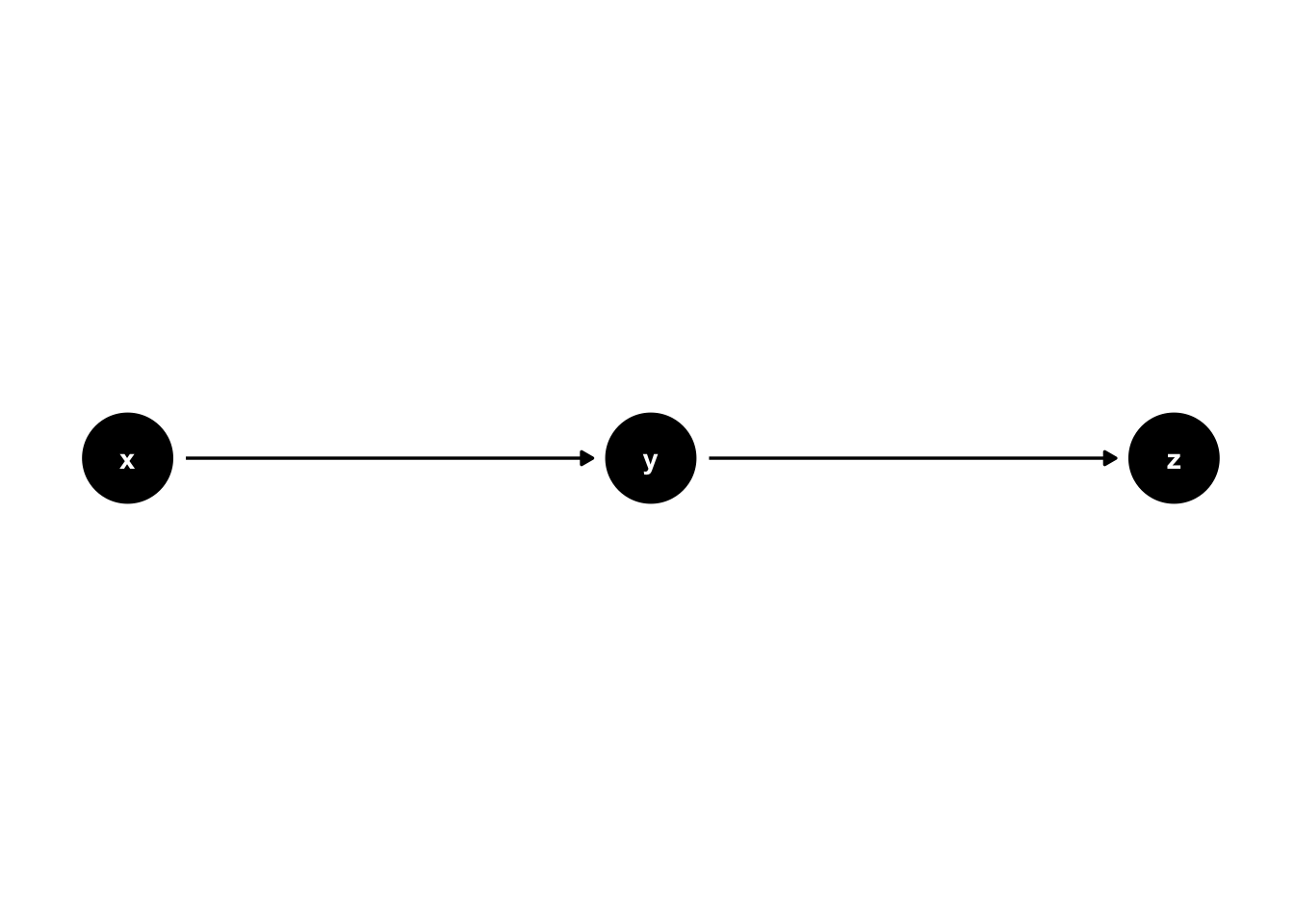
👆 Here’s what we did above:
We used the
dagify()function to create an object calledchainthat contains some code used by the DAGitty package to create DAGs.We added another formula,
z ~ y, to the...argument, which means “z is caused by y.” This value simultaneously tells thedagify()function two things. First, that the DAG needs to have aznode and aynode if it doesn’t already. Second, that there should be a directed edge in the DAG fromytoz.We added another set of coordinates to the
coordsargument. The told thedagify()function that we want the center of theznode to be placed on the plot at the spot where the x-axis is equal to 3 and the y-axis is equal to 0.
We used the
ggdag()function to plot thechainobject as aggplot2plot and print it to the screen.
44.4 Forks
The next structure we will learn to create with ggdag is the fork structure. A fork consists of 3 nodes and two edges, with both edges coming out of the middle node.17 We previously saw a fork when we discussed common causes and figure 44.7. Here is the code we used to create figure 44.7.
# Create the DAG called fork
fork <- dagify(
  x ~ y,
  z ~ y,
  coords = list(
    x = c(x = 1, y = 2, z = 3),
    y = c(x = 0, y = 0, z = 0)
  )
)

# Plot the fork dag and print it to the screen
ggdag(fork) +
  theme_dag()
The code above only differs from the chain code in the formulas we passed the ... argument of the dagify() function. This time, the formulas we passed told the dagify() function that “x is caused by y” (x ~ y) and that “z is caused by y” (z ~ y). Everything else remained the same.
44.5 Colliders
The third structure we will learn to create with ggdag is the collider structure. A collider consists of 3 nodes and two edges, with both edges directed into the middle node.17 We previously saw a collider in 44.5. Here is the code we used to create figure 44.5.
# Create the DAG called collider
collider <- dagify(
  y ~ x,
  y ~ z,
  coords = list(
    x = c(x = 1, y = 2, z = 3),
    y = c(x = 0, y = 0, z = 0)
  )
)

# Plot the collider dag and print it to the screen
ggdag(collider) +
  theme_dag()
Once again, the code above only differs from the chain code in the formulas we passed the ... argument of the dagify() function. This time, the formulas we passed told the dagify() function that “y is caused by x” (y ~ x) and that “y is caused by z” (y ~ z). Everything else remained the same.
With only these three structures – chains, forks, and colliders – we can create sophisticated DAGs with the potential to help us reason about almost any causal question we may want to ask. However, before we can use our DAGs, we must understand the rules of d-separation.
44.6 d-Separation Rules
Now that we understand the basic structures that make up DAGs, we can use the rules of d-separation to estimate average causal effects from DAGs when all assumptions are met. How do we do that? Well, the DAG will forms a model of the process that generate our study data. Again, a model is just simplified representation of some real-world entity or process. So, if we believe that our DAG is “close enough” to accurately representing how conditions in the real world work together to create our outcome of interest, then our DAG tells us how values for our outcome of interest are determined in the real-world. It also tells us which variables in our analysis to condition on to isolate the causal effect of one variable from within the entire system.
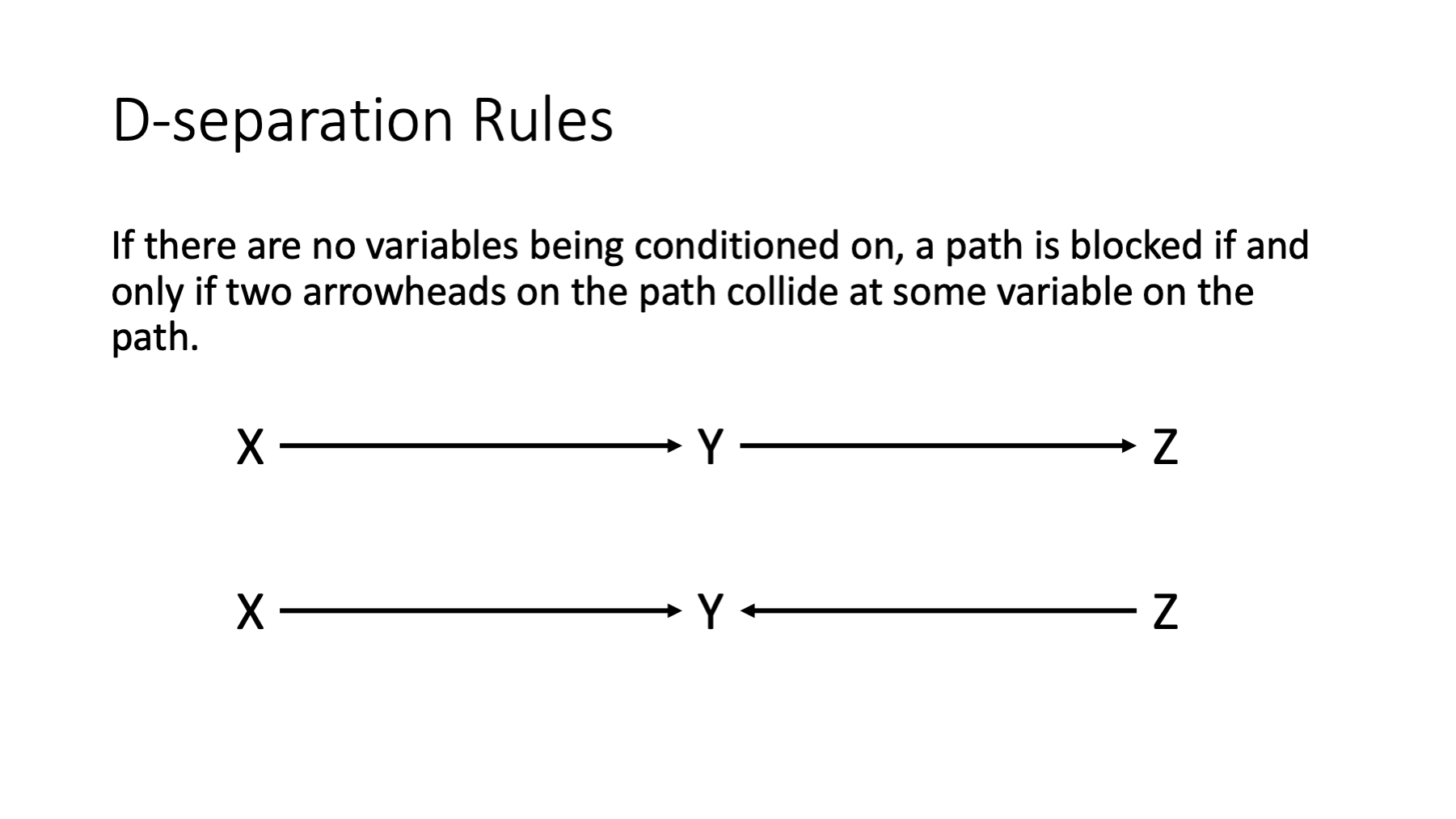
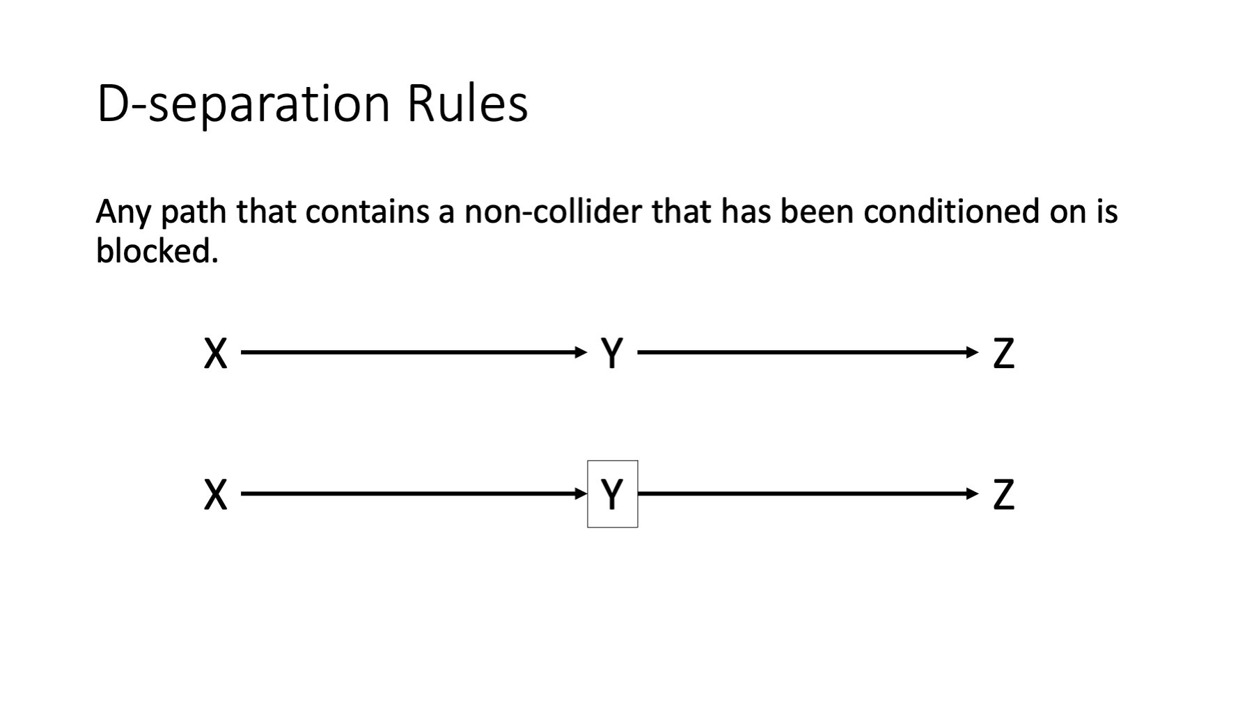
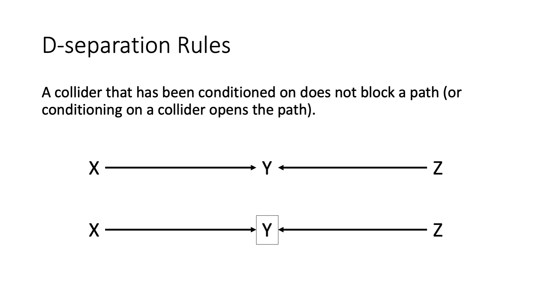
There are many ways we can condition on a variable. We can do so through restriction, matching, stratification (including regression analysis), and through weighting methods. Some of these methods were discussed in previous chapters and some will be discussed in subsequent chapters. Why would we want to condition on a variable in our study design and/or analysis? Typically, we condition on variables to deconfound our estimate(s) of effect. We will discuss deconfounding in greater detail in a subsequent chapter. For now, know that conditioning on a variable that appears in our DAG will often impact how we interpret our DAG and any subsequent analysis based on our DAG. And the rules of d-separation will help us with those interpretations. Here they are in their totality.
If there are no variables being conditioned on, a path is blocked if and only if two arrowheads on the path collide at some variable on the path.
Any path that contains a non-collider that has been conditioned on is blocked.
A collider that has been conditioned on does not block a path.
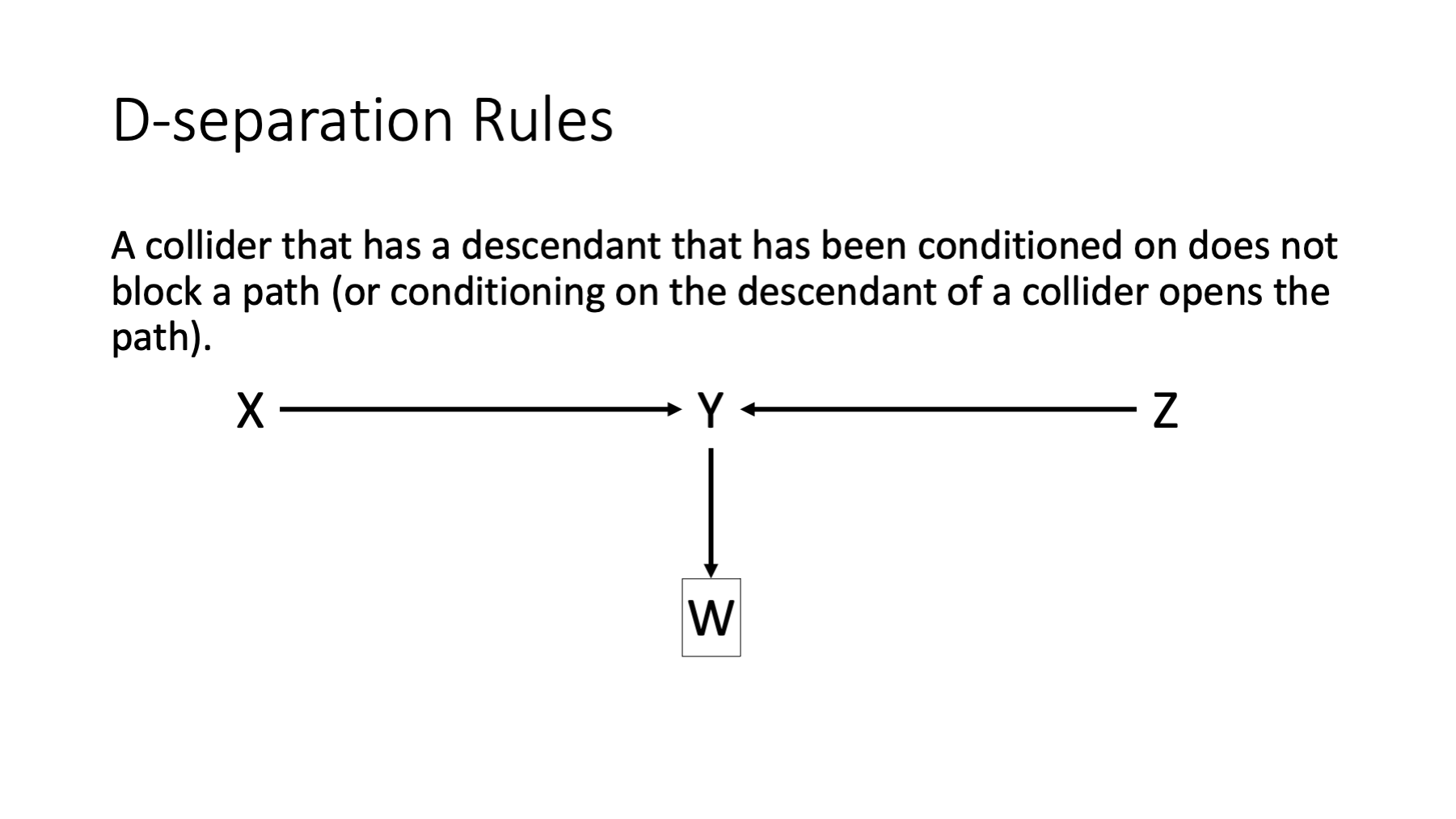
A collider that has a descendant that has been conditioned on does not block a path.
Two variables are D-separated if all paths between them are blocked.
Next, let’s look at each rule in isolation.
44.6.1 Rule 1
In the figure above, the first path is open because y is not being conditioned on and y is not a collider. The second path is closed because y is a collider.
44.6.2 Rule 2
In the figure above, the first path is open because y is not being conditioned on and y is not a collider. The second path is closed because y is not a collider and is being conditioned on.
44.7 Summary
In this chapter, we learned the basic structures that DAGs are made of. We also learned how to create DAGs with R and ggdag. DAGs are a powerful tool for causal inference because they are simultaneously qualitative causal models (encoding our assumptions and beliefs) and statistical models (encoding mathematical information). We’ve all heard that association/correlation does not equal causation, which is true. But, if we are willing to accept the assumptions baked into the qualitative causal model (the graph picture), and follow the rules of d-separation in our study design and/or analysis, then any statistical associations ARE casual effects. The remaining controversy and uncertainty around DAGs comes from the “if you are willing to accept the assumptions” part of that last sentence. The assumptions are not always reasonable and often can’t be directly tested; however, even in the absence of complete certainty, DAGs have shown themselves to be a useful tool in epidemiology over and over.